Goodbye, Waiting Rooms!

According to Vital, 20 percent of patients have changed doctors due to long wait times and 30 percent have walked out of an appointment because of a long wait.
An accelerated shift in patient expectations has invited a push toward more on-demand services and goods—including increased pressure for shorter wait times and seamless experiences. The rigidity and inefficiencies of typical healthcare settings often creates staff and client bottlenecks in check-in and administrative forms, unpredictability in provider schedules, and removes agency from patients who tie their overall satisfaction and perception of information and care to wait times.
However, new technology has reimagined dated healthcare design models that limit these friction points, add efficiencies to both operations and patient management, and empower patients to regain control of their experience—not only improving the bottom line but the delivery and quality of care.
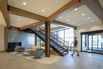
Introducing: No Waiting Rooms
Eliminating the waiting room, Village Health Partners in Frisco implements self-rooming that empowers patients and maximizes throughput to redirect time saved in administration and managing patient flow to time spent with patients. Clients control their circulation from home to the exam room—booking appointments and signaling their arrival via app, follow steps to their reserved space, and manage additional information and scheduling at their fingertips.
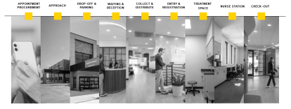
Removing stressors, standardizing design and processes, and reorganizing typical typologies, the new patient journey serves as a guide for future development for Village Health Partners and those exploring the future of a new kind of patient journey.
A New Patient Journey
More than efficiency, the self-rooming model at Village Health Partners is guided by the importance of understanding the patient experience, set with intention, and reducing the footprint of time and space. Where the traditional patient journey is fractured and interrupted at several touch points from appointment procurement to parking and registration to check-out. The self-rooming model is a product of identifying these nodes with the lens of a more patient-focused, purposeful, and efficient options.
Rather than wait in a waiting room and then bounce from room to room for vitals, labs, and other procedures before waiting again in their exam room, the patient experience is simplified in a single location. Check-in is moved to digital platforms. Blood tests, temperature, identification and insurance verification, vaccinations, and scheduling all happen in a single exam room to limit decision points. Choreographed around a single location instead of tracking patient progress and moves, staff operations find additional efficiencies that optimize throughput, reduces wait times, better manages patients, and minimizes the likelihood of elopers, or those that leave without follow up.
For those that desire a more traditional experience, a check-in desk provides support for those who prefer an analog experience, who lack internet access or technology, or who need special accommodations. Family spaces outside patient rooms provide welcoming, residentially inspired spaces that serve as reception, waiting areas for accompanying guests, or can be flexed as spaces for those who may need additional waiting or gathering spaces before or after an appointment.
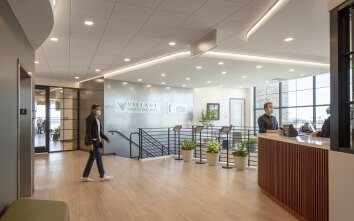
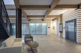
The first year at Village Health Partners Frisco improved Time of Service (TOS) collections by 1.5%
Technology + Planning = Success
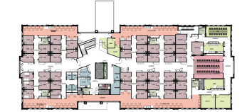
The self-rooming model at Village Health Partners has welcomed new standards in design and policy that replicated across the provider’s other locations encourage its continued success and viability. For example, standardized pods and exam rooms allow staff to quickly adjust the rooms to meet the changing needs of the facility, unique needs of a patient, alternative exam or appointment formats, or match the throughput of physicians.
A difference you can feel
Where traditional facility planning is designed for 1 physician per 5 exam rooms, the new model allows for standardized PODs to provide flexibility for the doctors during peak times.
With additional responsibility for the client to navigate to their destination, enhanced and layered communication for staff and clients supports their arrival at the right time and place. Simplified wayfinding can help clearly call attention to key destination points and guide patients through their journey. Banquettes line key pathways while also creating a less clinical environment. As a means of emphasizing the location, the Village Health Partners’ Plano location uses street names to tap into the power of familiar wayfinding mechanisms.
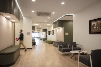
Strategic location of the most used amenities and services not only eases navigation but also adds an opportunity for time savings. Discovering that most patients required lab work, the design situates the lab closer to the front—minimizing travel time while more efficiently managing patient progression. Staff no longer needs to direct patient to that step in the process or wait for lab work. Rather, the process adds predictability with thresholds for arrival. Integrated technology can confirm patients have completed necessary paperwork and lab work or imaging prior to arriving to their exam room.
Dedicated spaces for staff removed from onstage activities allow for heads down work and relieve them of those forward-facing responsibilities. Situating these along exterior walls invites natural light into the space while maintaining connection between physicians and medical assistance and providers and patients—encouraging continuity and ease throughout.

The increased agency to patients also requires additional consideration to security and access. The opportunity to wander means a more defined separation between on and off-stage activities. In the event of an emergency or breach in security, providing a mix of restriction levels and locations matched to the population mix and needs of a location allow staff to balance security needs with patient independence.
While waiting may always be somewhat inherent to the healthcare setting, the self-rooming model advances how we approach the quality of care—driving a better client experience, streamlining operations, and ultimately, encouraging better outcomes for both the provider and patient.
No Waiting Room
No one likes waiting, especially for their healthcare provider. Take a look at how Corgan designed a self-rooming model that does away with the waiting room altogether. Improving throughput and streamlining operations by creating a central touchpoint and tapping into the power of technology, patients can spend more face time with their physicians. Listen in as Jordan Gill, Senior Associate in the Healthcare Studio, shares how the new model and innovative design reshape the patient experience as we say goodbye to the waiting room.
