Enhancing User Experience at Cancer Clinics

Unique Stressors
When designing an oncology clinic, it is especially important to think about the user’s experience. It goes without saying that cancer treatment is a uniquely stressful experience, but it is also one that involves a lot of waiting: infusions of chemotherapy, immunotherapy, or other targeted treatment drugs can take anywhere from 30 minutes to more than five hours, depending on the treatment. These treatments may happen monthly, weekly, or even daily. Keeping this in mind, Corgan designed two cancer clinics for McKesson in Texas and Arizona that were centered around mitigating this stress by allowing infusion patients some choice in their environment and facilitating a connection to nature.
Case Studies
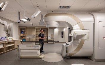
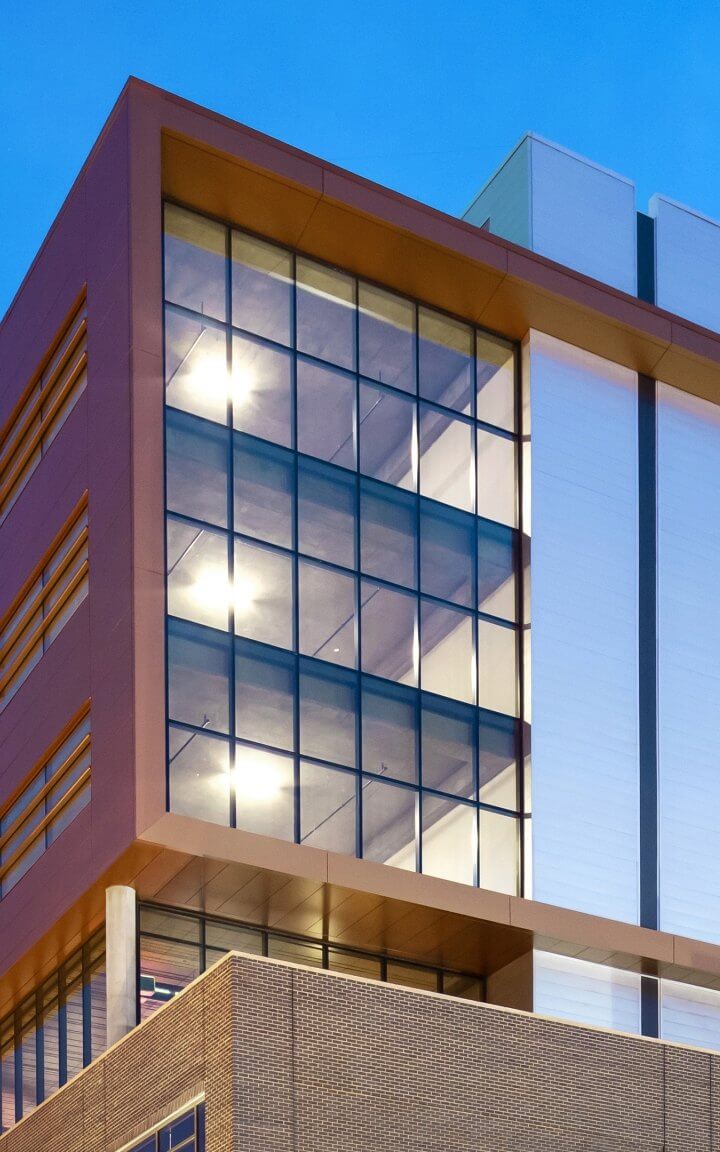
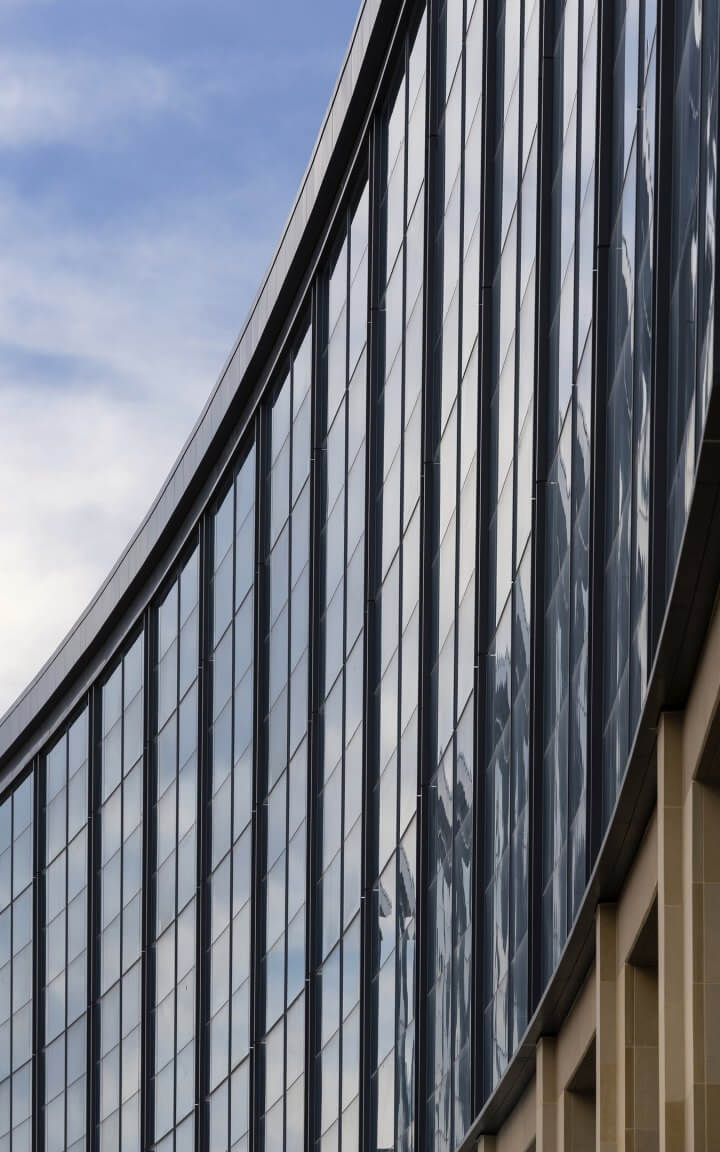
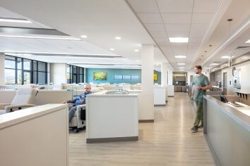
At the Northeast Texas Cancer and Research Institute, a comprehensive oncology center in Tyler, TX, the treatment area is oriented toward a greenbelt with views outside to trees and a garden. A stone wall at the entrance and floor-to-ceiling windows were used to create a calming, nature-focused environment, while pods of four chairs enable patients to interact with vistors and other patients. The pods are separated by half-height walls, so patients can choose a more private or a more connected space depending on their preference. Located on the CHRISTUS Trinity Mother of Francis Hospital campus, the three‑story Class A medical building also provides leading-edge medical care, research, laboratory testing, and a dedicated pharmacy. To make the necessary housing for three LINAC imaging machines less imposing, the six-sided concrete vaults were built into the existing topography of the sloped site.
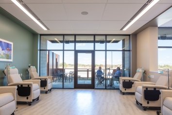
For the Arizona Oncology Prescott Cancer Center, the idea of a calming natural environment was taken one step further – the angled entry to the building was used to break up the larger infusion area into smaller, four- to eight-person pods. These semi-private pods each have access to an outdoor patio with wingwalls and a trellis for privacy. Patients wanting more companionship can venture further into the open area connecting the patios. Aesthetically, the center pulls inspiration from the desert environment to create warm, comfortable spaces. The exterior design inspiration comes from the local use of natural materials in warm and inviting color and texture combinations.
As we continue to design more cancer clinics throughout the southwest, we are focusing on ways to continually improve the patient and provider experience:
Simplifying Wayfinding
Healthcare design – and oncology in particular - presents a challenge that is mirrored in aviation projects: how can we design a facility that delivers a stress-free, intuitive experience for first-time visitors (travelers, patients) who are likely stressed and faced with a lot of waiting in an unfamiliar place?
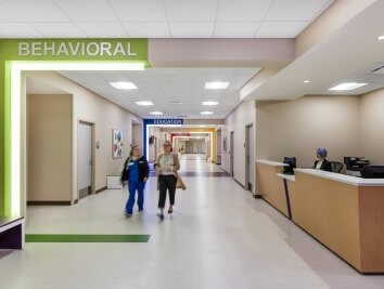
In both project types, one way to reduce stress for first-time or sporadic users is to focus on intuitive wayfinding: in addition to plentiful signage, using lighting, color coding, and architectural features to cue users to circulation paths. These strategies can be especially helpful when designing spaces for users who may not be literate, speak English, or have the eyesight to read text.
Both Northeast Texas and the Prescott Cancer Center simplify wayfinding by using architectural features to highlight the main entry and locating the infusion spaces directly off the main entry for ease of access. Prescott is a single-story facility, so using architectural features helps to organize the scale of the building and make wayfinding more intuitive. Since Northeast Texas is a 3-story facility, we located infusion on the main entry level – which is level 2. We then connected level 2 and level 3 - where the clinic spaces are located - with an open lobby. This makes the main entry a direct visual connection with the both the drop-off and adjacent parking garage: the double-height lobby uses large amounts of glass so there is a visual connection back to the entry and garage coming off the public elevators – further reinforcing the wayfinding experience.
Balancing Spaces
While the main design driver for oncology clinics is the patient’s experience, we also need to consider the other key user – the caregivers who work at these facilities. It is important for doctors, nurses, and other personnel to be able to provide efficient care to their patients and to collaborate seamlessly with each other. The current trend in healthcare is toward both individualization of care as well as increasing individual rooms as opposed to open space. The tradeoff is reducing efficiency – both in the physicians’ and nurses’ movements and of the footprint of the building. Since infusion treatments can take hours, clinics need to be able to fit as many patients in as feasible.

One new typology that maximizes the usable footprint of a clinic while reducing waiting is the self-rooming concept used at the Frisco Medical Village Office Building. The Frisco Medical Village project pursued self-rooming for exam rooms to significantly reduce wait times so that patients can have more interaction with caregivers. By challenging the typical format, the self-rooming model has proven successful for patient through-put and satisfaction rates.
Looking Ahead
As we continue to design and build new cancer clinics across the United States, we have the opportunity to ease the stress of cancer treatment. Of course, we can’t treat cancer, but through empathetic, user-focused, data-driven design, we hope to improve the experience for cancer patients through warm, biophilic, welcoming spaces.

